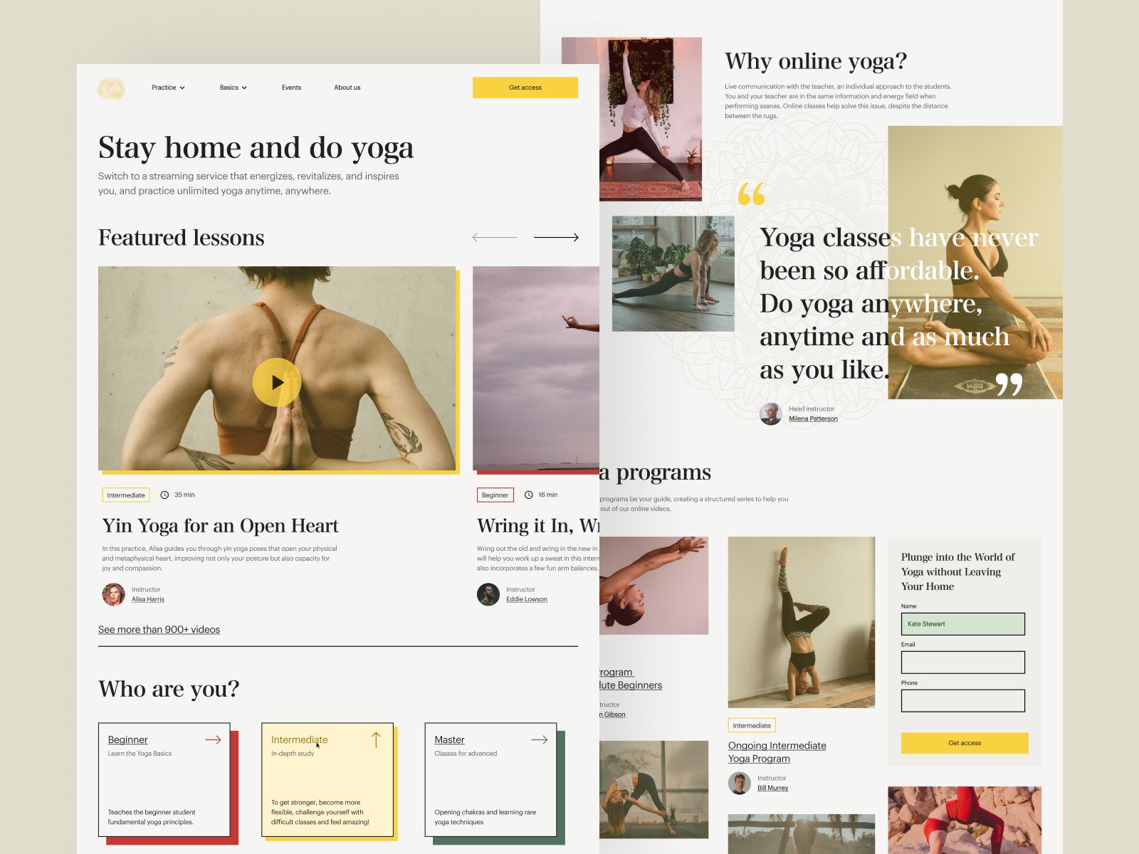
Yoga Website
Our experienced website design team has crafted a yoga website design concept that prioritizes ease of use and tranquility, mirroring the essence of yoga practice. The design features a clean layout, intuitive navigation, and personalized content, encouraging users to engage with the platform and start their yoga journey.
Functionality
The design concept for the yoga website focuses on offering a comprehensive online platform for yoga enthusiasts. The layout is structured to provide easy navigation between different yoga sessions, educational content, and personalized yoga programs.
It likely includes streaming capabilities for users to follow along with yoga classes from home, a selection of lessons categorized by difficulty, and information about the benefits of choosing an online yoga program.

Design Essence and Elements
- Soothing Color Scheme: The website utilizes a palette of earthy tones and soft neutrals, providing a calming visual backdrop that encourages relaxation and focus, essential for a yoga practice.
- Organic Textures and Imagery: Imagery showcasing people in various yoga poses adds a human touch, while the subtle use of textures may give the site an organic feel, resonating with the natural elements often associated with yoga.
- Responsive Video Thumbnails: The site features video thumbnails for different yoga sessions, which are likely responsive, giving users a preview of the classes and making the selection process interactive and engaging.
- Testimonials and Quotes: Strategically placed testimonials offer social proof and personal endorsements, lending credibility to the service and motivating new users to join.
- User Experience Levels: There's a clear differentiation between beginner, intermediate, and master classes, which helps users quickly identify the content most relevant to their skill level.
- Intuitive Navigation Menu: A top navigation menu provides clear pathways to various site sections such as practice options, basics, events, and an about us page, ensuring users can easily find what they're looking for.
- Prominent Call-to-Action (CTA): The design includes a noticeable CTA for users to "Get access," which is likely strategically placed to convert visitors into users by prompting them to register or subscribe.
- Structured Content Layout: The content is organized in a grid-like structure that is easy to scan, allowing users to navigate the various offerings and information effortlessly.
- Interactive Elements for Engagement: Elements such as the play button on video thumbnails and the arrows for navigating featured lessons suggest interactivity, encouraging users to engage with the content.
- Whitespace for Focus: The design makes good use of whitespace, which helps reduce clutter and focuses the user's attention on the most essential elements, like featured classes and sign-up forms.
- Personalized User Pathways: There's a clear pathway for users to follow based on their yoga experience, with the design likely allowing users to tailor their journey through the site based on personal preferences and progress.
Likely Benefits
This yoga website design concept likely benefits users by providing a seamless and calming user experience that reflects the tranquility of yoga itself.
Categorizing content based on skill level makes it accessible to beginners and advanced practitioners.
Including testimonials may enhance credibility and encourage new users to join, while the prominent call-to-action for access could improve user engagement and conversion rates.
Application by the User
Users would interact with this website by browsing the available yoga sessions and educational content. They can choose classes based on their skill level and interests and then participate in the sessions via streaming.
The website's design facilitates easy sign-up for new visitors and provides a personalized experience for returning users by remembering their level and preferences.
The design concept is applied so the user's journey from visitor to participant is smooth and intuitive. Each element is placed with the user's experience in mind, from learning about the program to finding the right class and signing up.
The design also supports the brand's message of inclusivity and accessibility, offering yoga that can be practiced anywhere and anytime.