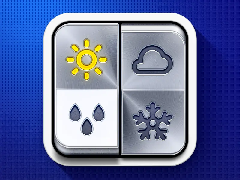
Weather app icon
Discover the pinnacle of brand representation with our meticulously crafted weather app icon branding design concept, a testament to the expertise of our brand design agency.
Functionality
The weather app icon branding design concept is designed to offer immediate visual cues about the current weather conditions through its distinct sections. The icon is split into four quadrants, each representing a different weather condition, which enables quick and easy comprehension for users.

Design Elements
- Sun Symbol: The sunburst in the top left signifies clear, sunny weather, using radiant gold lines that evoke a sense of warmth and brightness, instantly recognizable to the user.
- Rain Drops: Positioned in the bottom left, the silver raindrops against a subtle background provide a sleek and modern take on precipitation, effectively communicating rainy conditions.
- Cloud Symbol: The cloud in the top right features a classic representation of overcast or cloudy weather, rendered in a brushed metal finish that adds depth and sophistication to the overall design.
- Snowflake Symbol: The intricate snowflake design in the bottom right conveys the essence of cold, snowy weather with its detailed and precise form, resonating with the crispness of winter.
- Color Scheme: A monochromatic color palette with metallic shades gives the icon a professional and timeless quality, ensuring it stands out on any device screen.
- Material Texture: The metallic texture for each symbol provides a tactile sensation to the visual elements, suggesting a premium, high-quality application.
- Quadrant Layout: The quadrant-based layout lets the icon display multiple weather conditions at a glance, highlighting the app's multifunctional capability and efficient design.
Likely Benefits
This design concept can enhance user engagement by providing an intuitive and visually engaging experience. The iconic representation fosters brand recall, ensuring the app remains distinguishable amidst many digital offerings.
Application of the Design Concept
When users interact with your weather application, the icon serves as their first touchpoint, setting the expectations for a seamless and informative experience. The straightforward design ensures that users of all ages and tech-savviness can interpret the weather conditions quickly, fostering a sense of trust and reliability in your app.
In the second phase, the consistent branding across the app's interface reinforces your identity, creating a cohesive user experience that communicates your brand's attention to detail and commitment to clarity.
As a branding design agency, our goal is to create a concept that stands out visually and resonates functionally with the end-user. This weather app icon branding design concept achieves that balance, ensuring your brand is synonymous with style and substance. Overall, it’s a strategic blend of art and utility, crafted to elevate your brand and engage your users effectively.