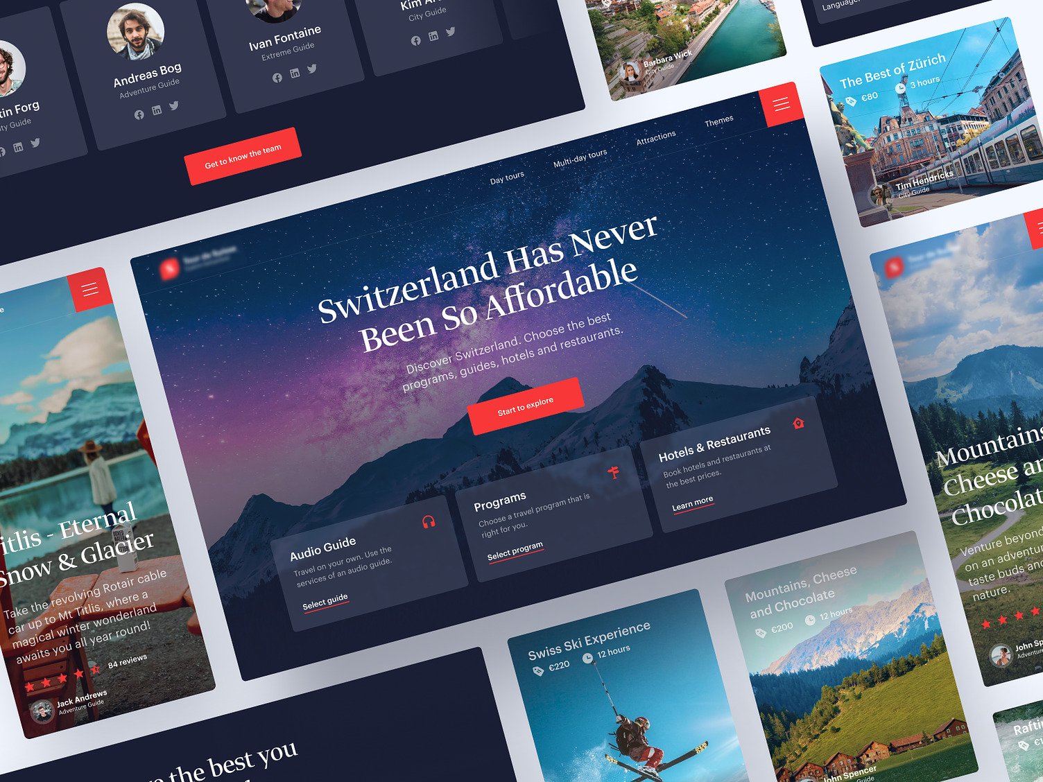
Swiss tourism website
This web design concept by experts encapsulates the essence of Switzerland's tourism offerings in a visually compelling and user-friendly interface designed to inspire and facilitate travel planning.
Functionality
The design concept created by our web design experts team is applied to create an engaging, intuitive, and informative user interface that caters to travelers looking for tours, accommodations, and experiences in Switzerland.

Design Essence and Elements:
- Visual Hierarchy: A clear structure where the most essential elements (like the search bar and leading offers) are more prominent.
- Color Scheme: Utilizes a cool color palette with blues and purples, suggesting tranquility and elegance, fitting for a travel-themed website.
- Imagery: High-quality images of destinations help attract and engage users.
- Typography: Modern and readable fonts enhance legibility and provide a contemporary feel.
- Navigation: Intuitive menu layout with clear categories (e.g., Day tours, Attractions, Themes).
- Call to Action (CTA) Buttons: Distinctive buttons like "Start to explore" that prompt user engagement.
Likely Benefits:
- User Engagement: Attractive visuals and clear CTAs likely increase user interaction.
- Information Accessibility: Well-organized information architecture aids users in finding desired content quickly.
- Branding: The design reinforces brand identity through consistent use of color, fonts, and style.
Application by the User:
- Users can navigate various sections (e.g., Hotels & Restaurants, Mountain Experience) to find relevant information.
- Interactive elements like audio guides can be selected for personalized experiences.
- Users can read reviews and ratings to make informed choices.
Overall, this web design concept merges elegance with functionality, inviting users to explore the best the country has to offer through a seamless digital experience.