Speakeasy
A digital meeting solution capable of assisting with your sales process and updating your CRM. That is the Speakeasy product concept.
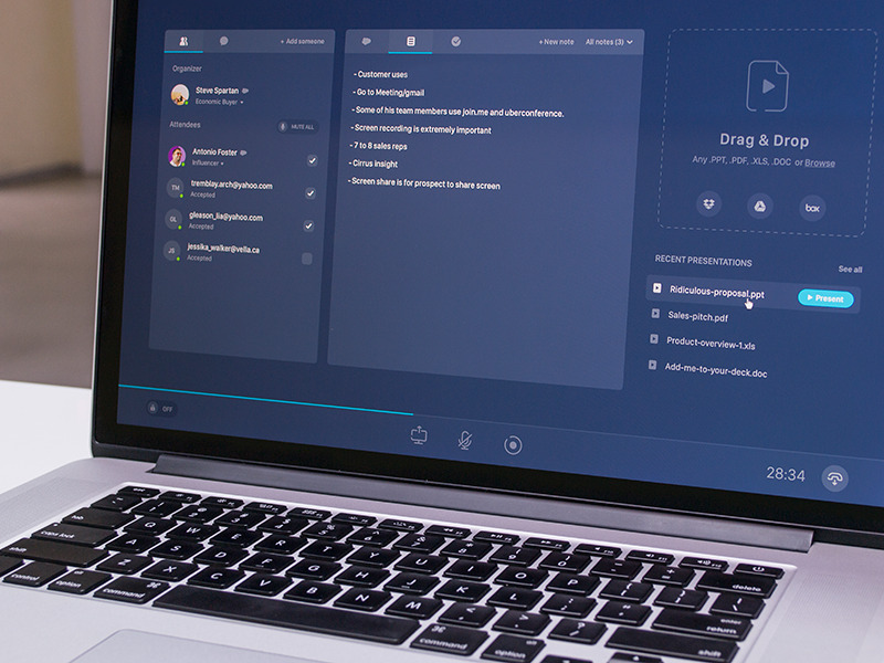
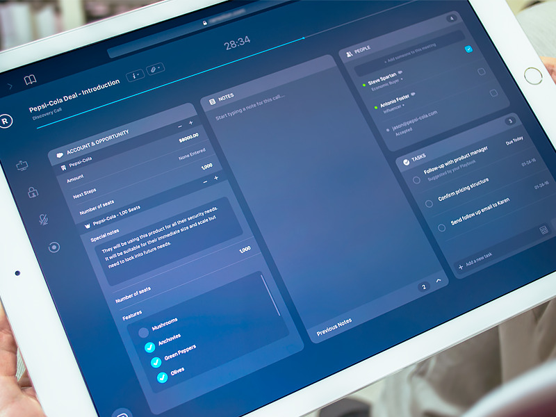
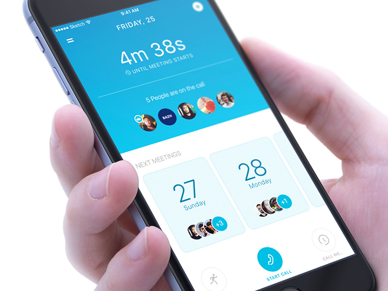
Speakeasy is a San Francisco company that creates a unique online meeting digital solution that is capable of updating your company’s CRM and pointing out your next steps to close more sales. Together with our friends from Speakeasy, our web design company San Francisco team was tasked with producing a solid UI/UX design for their digital product and refreshing their marketing website.
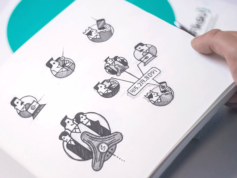
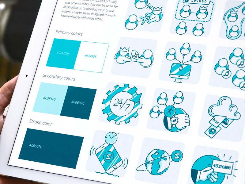
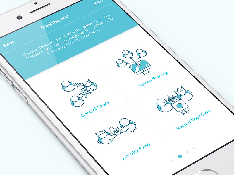
Our ux design firm has put a lot of emphasis on drawing base sketches for the app onboarding illustrations. That was done primarily to dive our heads into their product and its characteristics. Later several were included on their landing pages, the brand book, in-app icons, and the guide we designed for our Speakeasy partners. The key and most important thing here is to stick close with consistency on every format level and product platform.
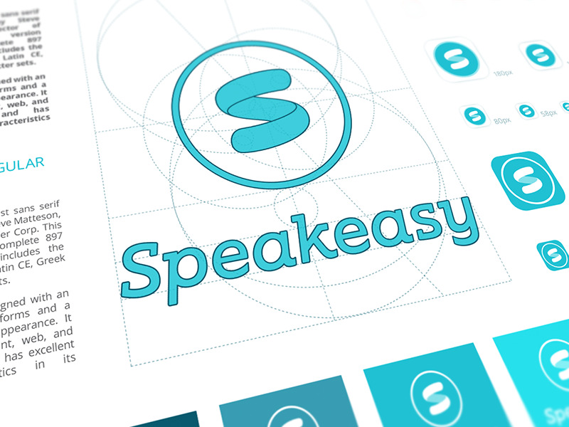
Consistency across every company asset does matter. It should not be all about visual aesthetics, as it involves another core factor - user trust. The user interacts only with your product’s visible part. They don’t have any knowledge of all internal business processes nor how they are structured. However, you can share your approach by having consistent and lovely identity illustrations. Moreover, a design system makes all future updates faster, and any designer can create additional components while preserving consistency.
Read also: