Recruiting Website
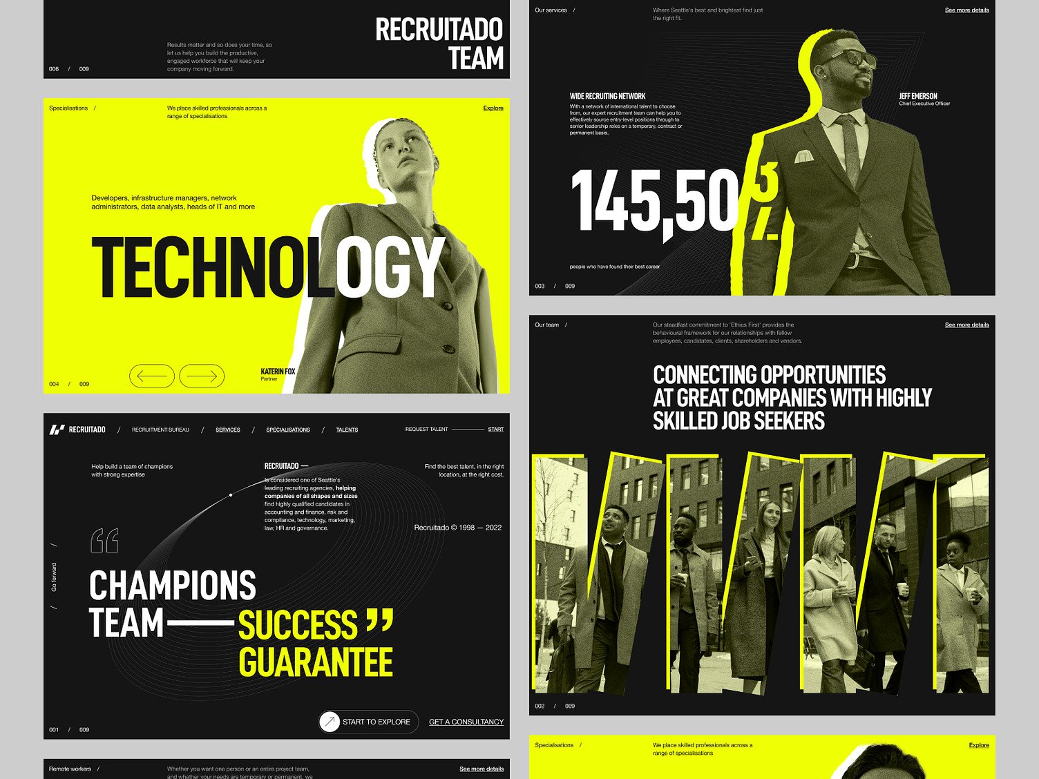
Experienced website designers have crafted this recruiting website design concept with a user-centric interface emphasizing the agency's successful placement rates and industry specializations.
Functionality
The design concept is focused on providing a dynamic and user-friendly interface for a recruitment platform that connects job seekers with potential employers. It likely includes interactive elements such as navigation arrows, clickable job categories, and a search function to filter through various specializations and job listings.
There's a clear emphasis on showcasing key team members and statistics to establish credibility and trust.

Design Essence and Elements
- Striking Color Palette: Using a vibrant yellow against a stark black background creates a visual impact that commands attention, a technique often employed to make critical information stand out and convey a sense of energy and dynamism.
- Dominant Typography: The design employs bold, sans-serif typefaces for headings, ensuring legibility and imparting a modern and professional tone. The size and weight of the fonts are meticulously chosen to establish a clear hierarchy of information.
- Consistent Imagery with Color Overlays: Professional photographs are unified by a selective color overlay, which ties them into the overall color scheme. This adds to the visual appeal and ensures consistency throughout the user's journey on the site.
- Interactive Content Sliders: The presence of carousels allows for a compact presentation of content, enabling users to browse multiple items without overwhelming the page layout. It's a space-efficient way to offer access to a range of information.
- Ethos Statements and Testimonials: Incorporating bold statements and endorsements builds confidence in the brand. It's a strategic placement of social proof to underline the company's track record and reliability.
- Featured Personnel Profiles: Highlighting key team members with their photographs, names, and titles personalizes the experience and adds a layer of transparency, fostering trust between the user and the company.
- Designed Visual Hierarchy: The thoughtful arrangement of elements, from large, attention-grabbing headers to smaller, less prominent text, guides the viewer's eye through the content logically, ensuring a user-friendly experience that naturally progresses from one section to the next.
- Infographic Elements: The inclusion of numerical data and statistics in a highly readable format acts as an infographic, providing a quick snapshot of the company's success and scope without delving into dense textual content.
Likely Benefits
This design concept benefits users by providing an engaging and straightforward navigation experience, allowing them to quickly understand the company's services and find relevant job listings or information.
This approach can help establish a strong brand presence for the company, highlighting its success rates and expertise areas, which may lead to increased user trust and higher engagement rates.
Application by the User
Users would navigate this website by interacting with the various elements presented, such as clicking on different technology specializations to explore job opportunities or using the arrows to view more team members or services.
They might also engage with the statistics presented to gain insights into the company's performance and success in recruitment.
In common, The application of this design concept is to facilitate the recruitment process for both job seekers and employers.
The design's intuitive layout and bold visuals aim to make the search and application process seamless, highlighting the company's brand identity and core values through strategic content placement and design choices.