Movie Recommendation Website
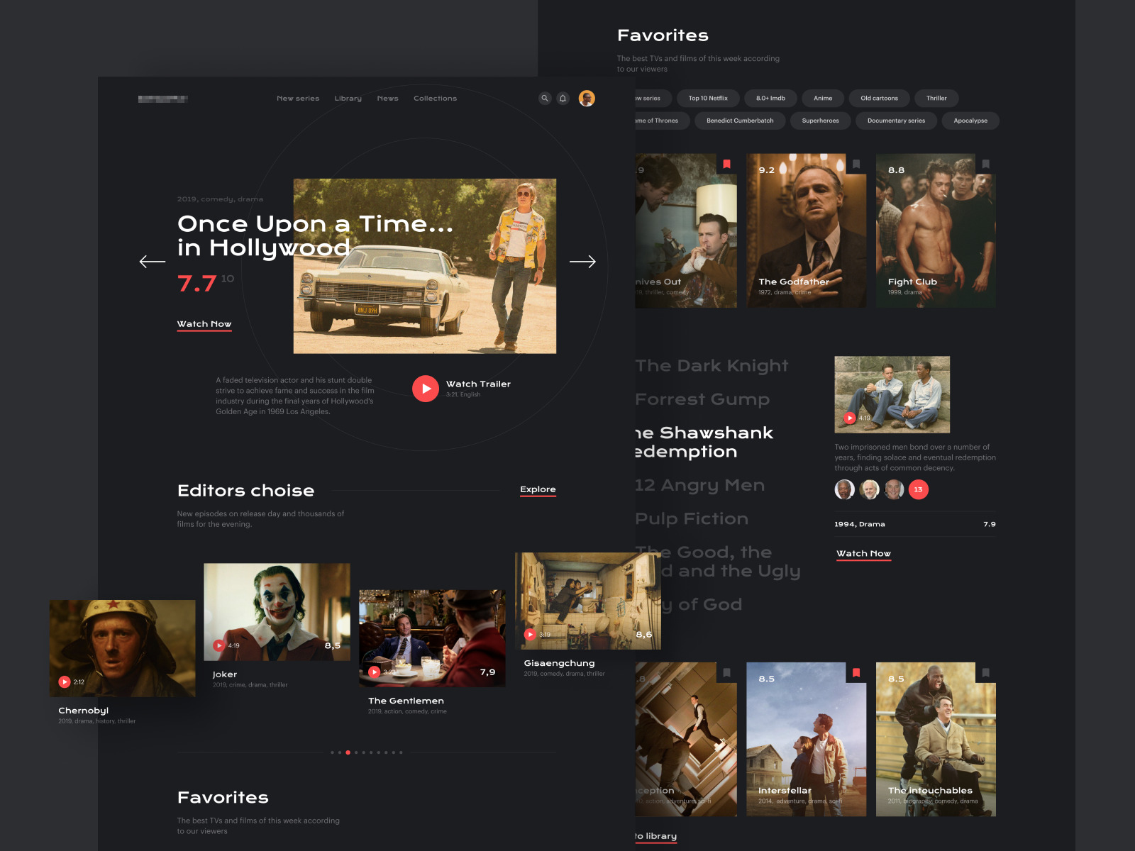
This movie recommendation website design concept is a visually striking, user-friendly interface that simplifies finding and enjoying movies. It combines aesthetic appeal with practical functionality to enhance the user's movie discovery journey.
Functionality
The concept functionality is centered around providing users personalized movie recommendations and allowing them to browse different categories like new series, library, news, collections, and favorites.
The interface features ratings, genres, a brief description of the movies, and options to watch trailers or the films themselves. It also allows users to mark certain movies as favorites for easy access.

Design Essence and Elements
- Clean and modern user interface (UI)
- Use of a dark theme with contrasting text for readability
- The navigation bar at the top for different sections
- Large, engaging movie thumbnails
- The rating system is displayed prominently
- Movie genres and brief descriptions are visible
- Carousel format for browsing through recommendations
- Editor's choice section for curated picks
Likely Benefits
The benefits of this design are numerous. It allows for an engaging user experience, making it easy to discover new movies and track favorites.
The dark theme is visually comfortable for users browsing in low-light environments.
The rating system and editor's choices could guide users to quality content, and categorizing movies ensures a tailored experience, potentially increasing the time spent on the website.
Application by the User
Users can apply this concept by navigating through the different sections to find movies they are interested in. They can watch trailers, add movies to their favorites, and read through the editor's choice to find expert-curated films. The carousel format further enhances the seamless browsing experience, allowing users to explore a wide range of movies easily.
Overall, the design concept is applied through its clean layout, strategic use of space, and interactive elements that encourage exploration. The dark background highlights the content and minimizes distractions, while the rating system and categorization help make informed choices. It is designed to be intuitive, minimizing the learning curve for new users and providing a rich experience for returning ones.