FLYR
Flyr is an innovative platform that forecasts airline data and translates it into an exciting travel planning journey.
Flyr uses the power of AI to generate data-driven, personalized approaches to airline offerings. They provide real-time data forecasting to their customers that translate into an enhanced end-user travel planning experience. Flyr is currently on a global mission to radically change the way airlines do business.
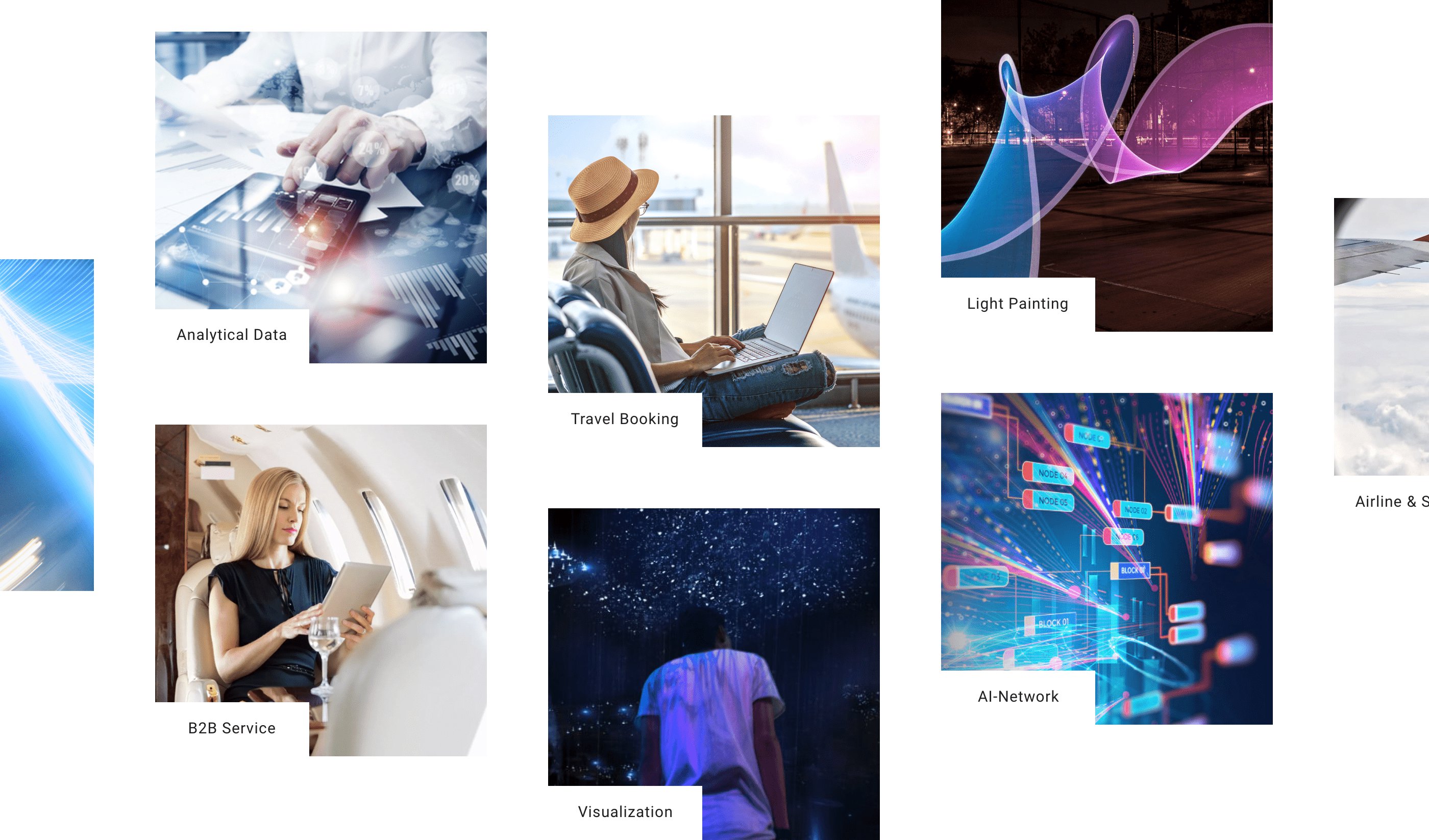
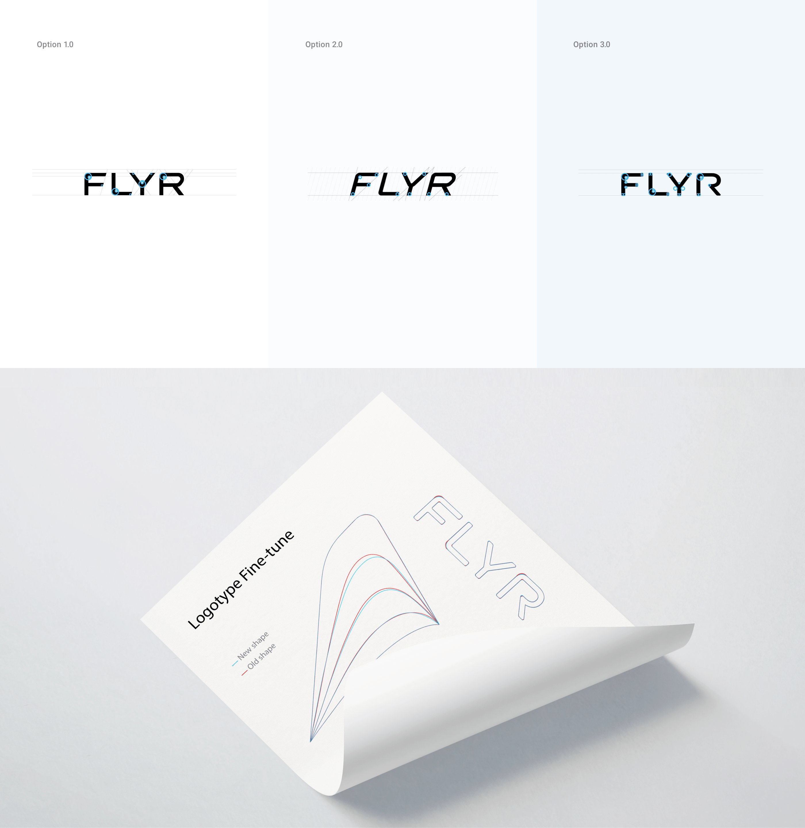
The collaboration between the Flyr team and our branding agency in San Francisco began with logo refreshment and the subsequent brand evolvement. We wanted to experiment with the color and add a mark that would complement the existing logotype while treating carefully anything that had already become familiar to users. To do this, we discussed the critical aspects of the business, collected attributes, and prepared mood boards to find the right feel and inspiration for further work.
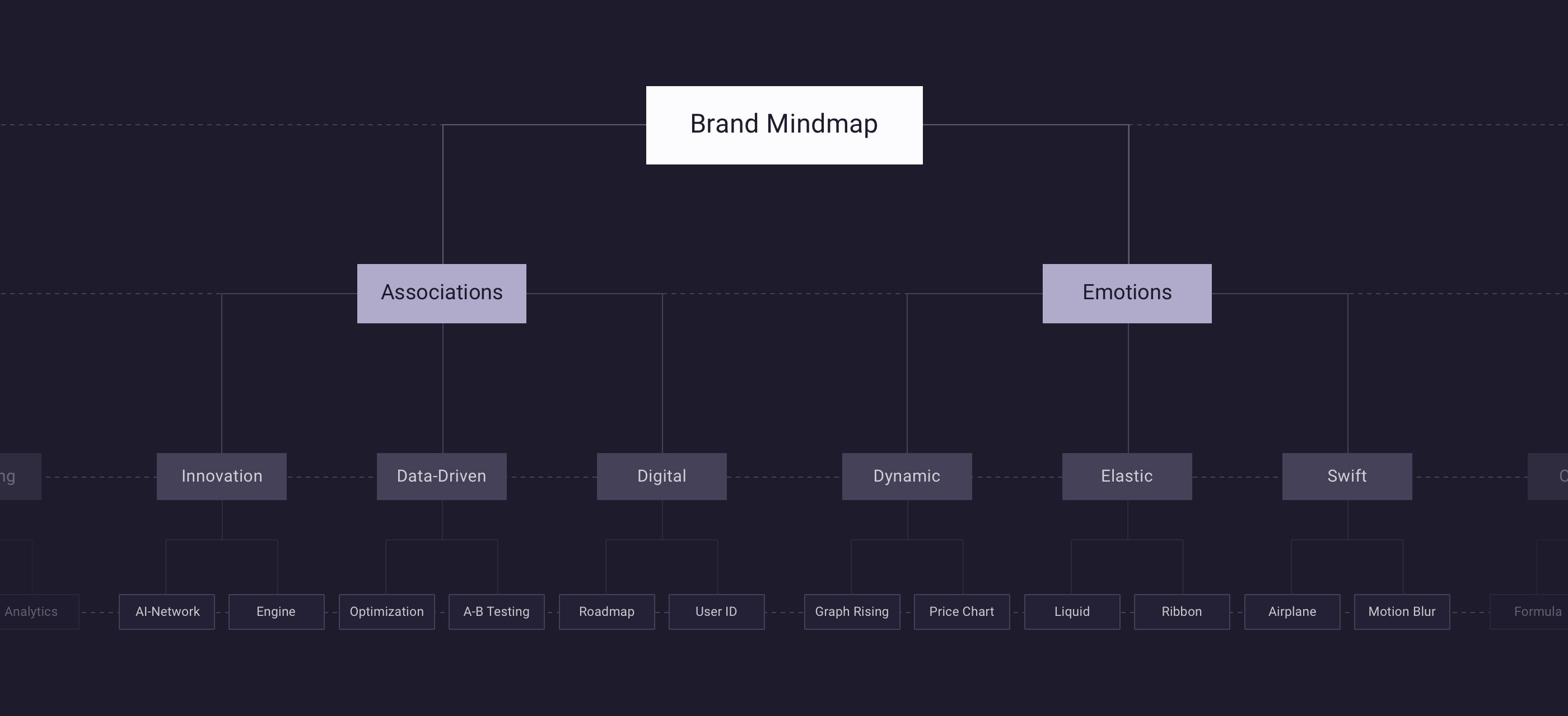
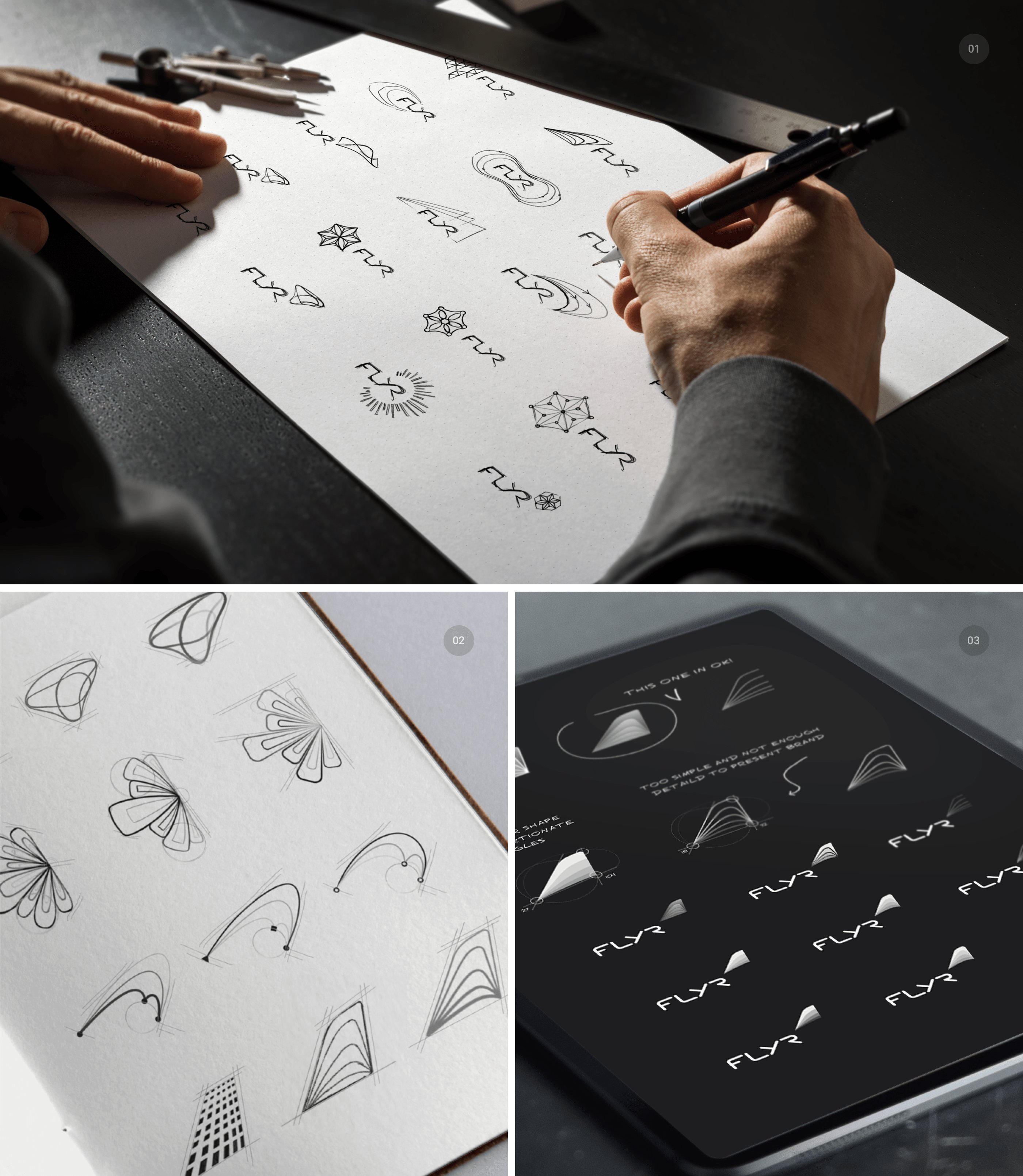
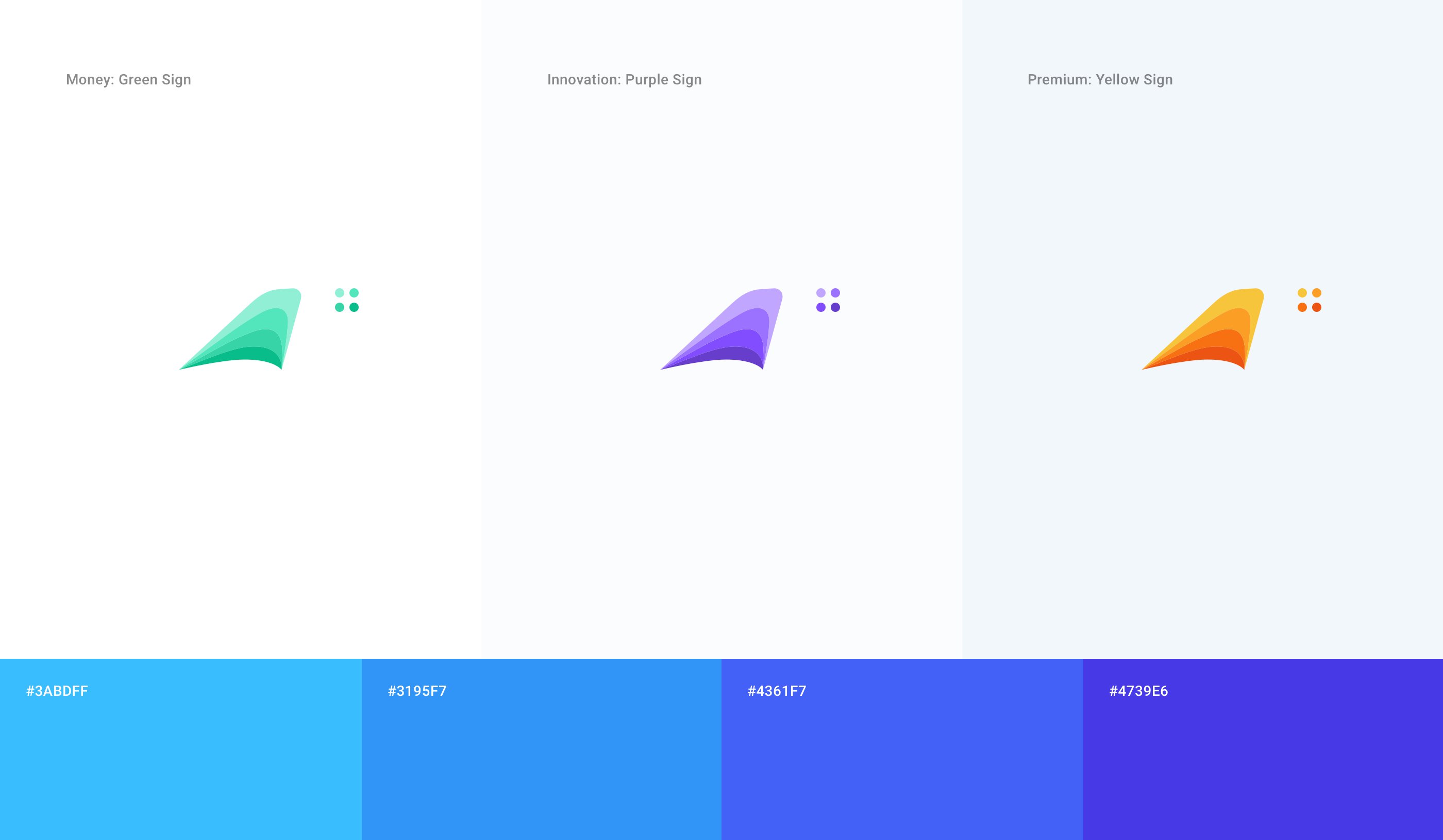
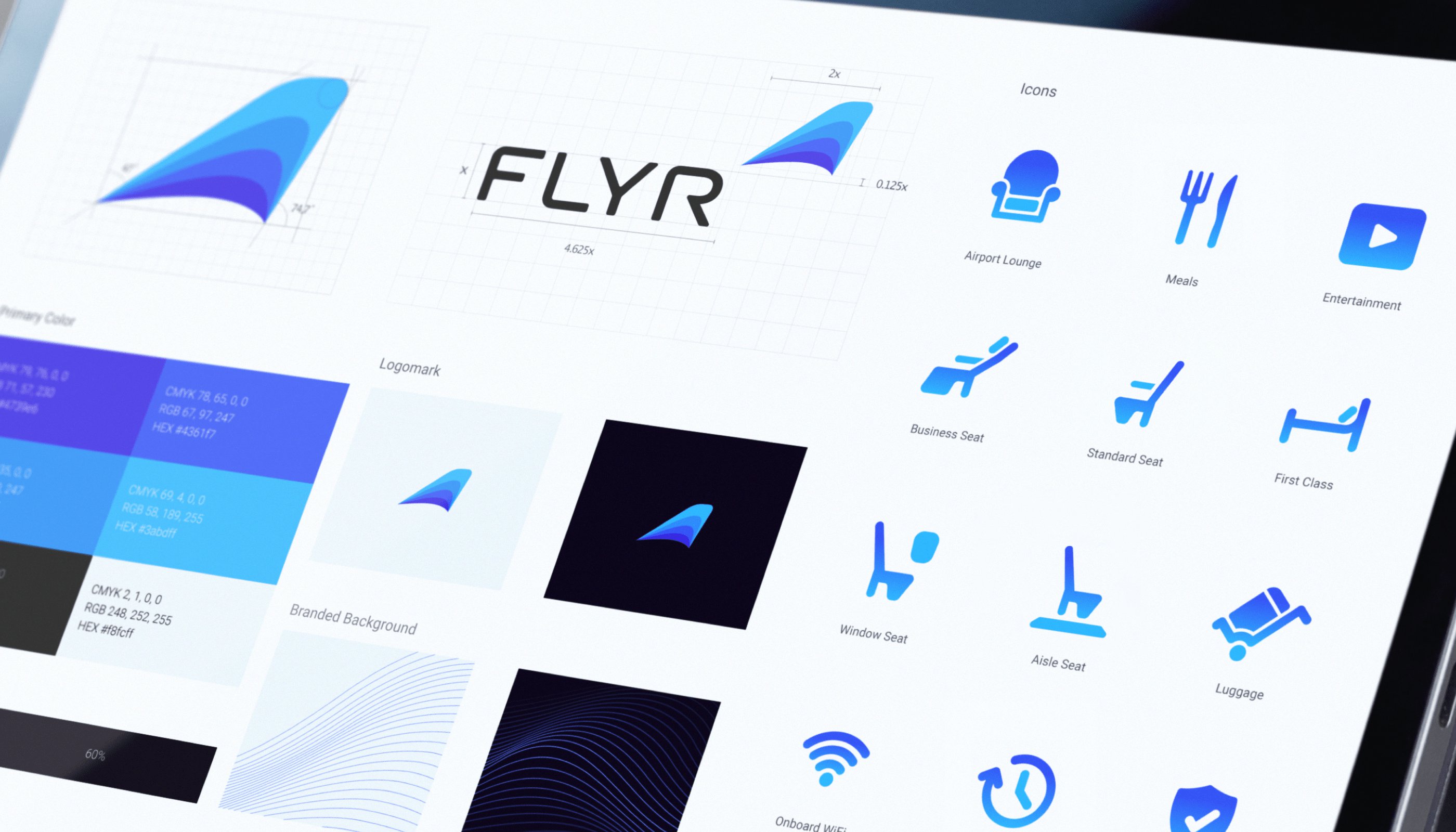
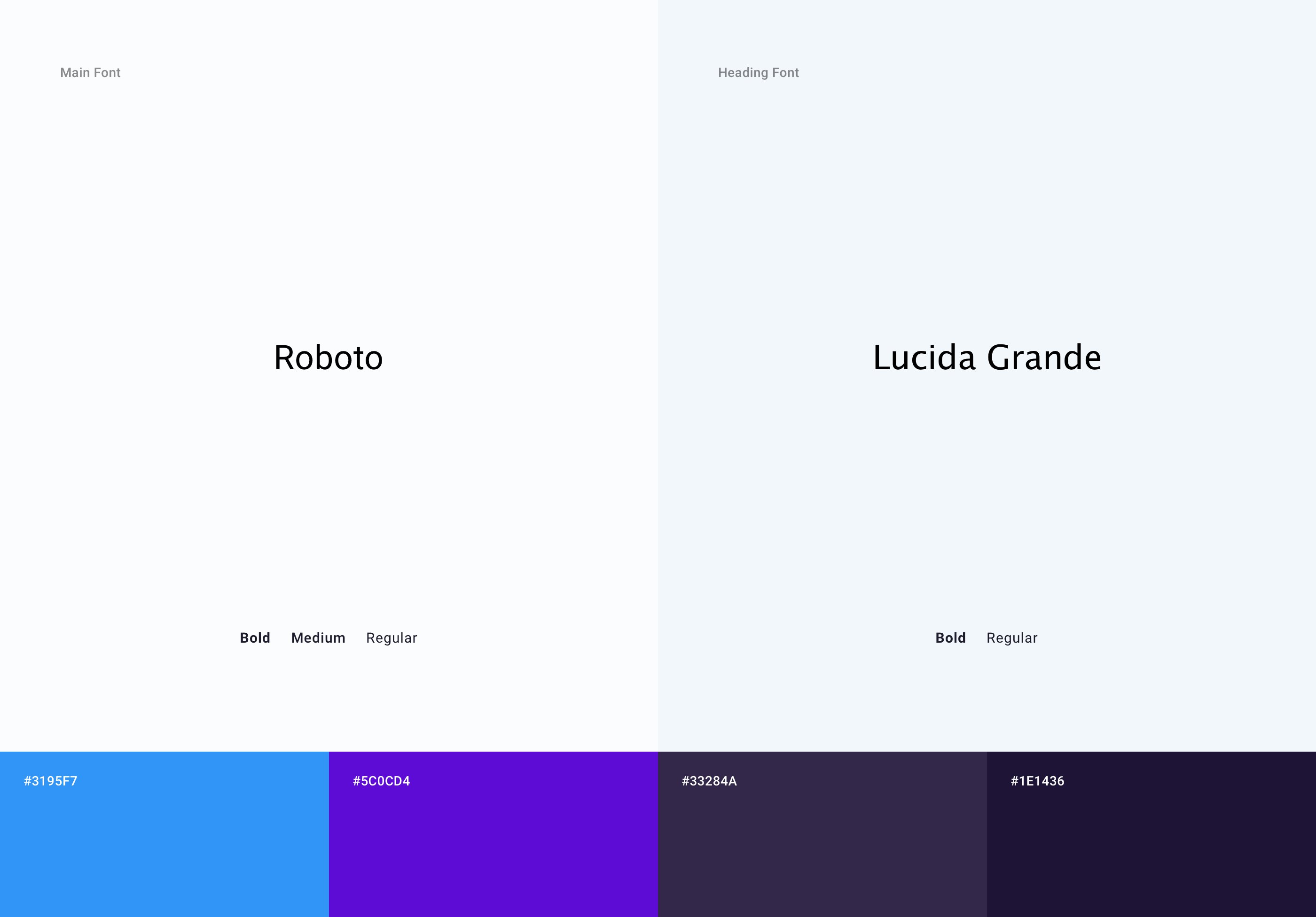
Furthermore, we created a composite word list of nouns that depicted the business and matched it with a visual representation of trust. Based on them, we started working on simple hand-drawn shapes and objects. When it came to the colors, we chose several blue tones with purple shades. They were adapted from the earlier logo and were highly tech-oriented. As a result, we created a visual asset guideline, color palette, recommended typeface, patterns, use case recommendations, several icons for future integration, and more.
Afterward, our website design agency in San Francisco applied most of our design assets to a responsive and consistent website structure and information architecture. We went through several conceptual iterations and were pretty brave with proposals. However, we landed between crazy full-screen animations and a privacy policy page-type design.
