Firefox
Designing a master brand to unify Firefox product family.
About
Firefox Browser is a Mozilla locomotive product trusted by millions of users. Our partner asked for help in creating the Firefox master brand, which would combine the Firefox Browser itself with several existing and new products under one roof. The main objective was to transfer the feeling of trust that Firefox Browser users enjoy to the entire brand family in the future.
Usage
150MMonthly active users (MAU)
Safety
450 billionTrackers blocked by Firefox with Enhanced Tracking Protection
Visual identity systems help businesses solve problems
Brand success, as with Firefox, often begins by producing one exceptional product. Then, to grow and create new products quickly and scale the brand family, you need a visual identity system. The presence of such a system solves, first and foremost, a business’s challenges.
Save loyal users: The brand family, competently grown from one master product, retains recognition and transfers equity to other products in the line.
Gain the trust of new users: The presence of standard rules and principles within the visual language accelerates the creation of marketing assets and creates uniformity throughout the visual layer of the brand. Consistency evokes trust.
Reduce costs and save time when launching new products: The process of creating new products, maintaining uniformity, and managing a brand is becoming more accessible, faster, and cheaper with a transparent visual hierarchy system.
Inform customers about changes in the company: The brand system generates an external harmony that evokes a feeling of balance throughout all of the company’s products and services on offer. Often, updating a visual identity is a way to make internal, invisible changes externally visible to the people that use the company’s products.
Increase team motivation: Attractive visual identity positively affects a team’s motivation levels as well as their state of mind because it conveys the values and principles of the company.
Firefox scaled brand structure in the face of uncertainty
At the beginning of the project, the Firefox team did not fully understand how they wanted to scale their brand structure and how many products they wanted to have. They proposed that we collaboratively start working with an idea that they were positive they wanted to move forward with: the master brand. The Firefox team identified three research areas: Fox, Fire, and Free. Sean Martell, a Firefox designer, explored Fox’s direction, while Jon Hicks explored the direction of Fire.
Our team began to work on a Free referral, and we received no strict guidelines for the direction we should take. While no borders or restrictions may seem ideal, the lack of benchmarks can make a task quite difficult. Nobody knew the complete list of future products, their quantity, or hierarchy. There was also no understanding of the precise requirements for the system in terms of scalability and flexibility. Thus, we needed to study how to form product images coherently and how to build an expandable family structure. To accomplish this, we applied our Design Funnel approach.
Companies often struggle when redesigning their brand identity
It’s challenging to swap the old for the new, especially when users are familiar with a logo and visual identity. Our experience shows us that to adopt a new identity, a client’s team needs at least two months to create it. And the more history that a brand has, the longer this process takes. This is because brand identity is ingrained into their products, services, and users’ mindsets.
Unfortunately, there are design agencies that do not pay attention to this. Such agencies accept a redesign task, don’t ask the right questions or spend the necessary time doing research, disappear for a few weeks, and then return with a solution that may not be approved.
While this method can prove successful from time to time, the agencies that don’t collaborate with their client are less likely to receive a stamp of approval. And sometimes, even an appropriate design solution will be misunderstood if the client doesn’t have enough time to analyze the new visuals, understand the meaning behind their direction, and become acquainted with the new visual language.
If rushed, the client may perceive the new identity concept as something alien and lacking in necessary contribution from their team. The Design Funnel takes this into account and thus anticipates and solves this problem.
The design funnel method simplifies decisions for clients
We’ve engineered the Design Funnel approach so that it starts simple and, once baseline visuals are agreed upon by all parties, evolves to tackle complex tasks. We believe that this allows the client to be involved in the decision process early on, only taking a step back once we’ve established a guideline for them to follow.
This makes it easier for the client to make several simple decisions throughout the process rather than a single difficult one at the end. Therefore, we divide the work into stages. We discuss and approve the results iteratively with the client.
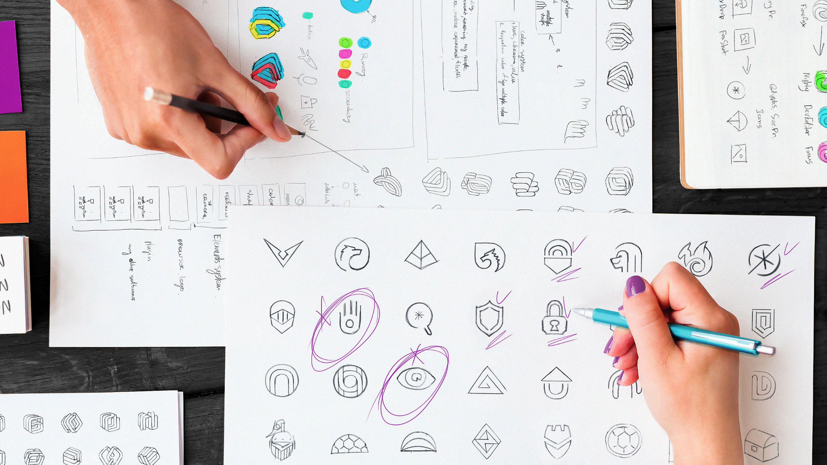
At the beginning of the job, the team examines dozens of “Low fidelity” sketches and studies which characters and conceptual metaphors are best suited to the brand strategy and the company alike. The design team justifies each decision and recommends which areas to explore further while simultaneously discarding the branches that seem to be dead ends.
The design funnel solves identity issues early on
Such a process helps to identify any possible problems that the customer has in the early stages. For example, during the Low fidelity stage of sketches for one of the products within the Firefox family, we were studying a product that Firefox developed to protect users’ data.
The task was to identify possible negative interpretations of forms and images and we did this by testing how people perceive metaphors. The Firefox team also tested the perception of images on its side. We collaboratively discovered that a certain number of users associated an open palm (akin to “stop”) with a religious theme, and the image of an eye with the concept of tracking users or those who lurk without their permission. Therefore, we stopped the development of these two areas, because these perceived meanings did not correspond to the task at hand.
Teams and clients form a brand language together
Clients feel more comfortable when they understand the what and the why behind each iteration as well as what they can contribute, influencing the result positively. While the client’s input is critical, we, as brand design experts, have a responsibility to share what we’ve learned from our past experiences and explain the current industry trends to help our clients understand our visual choices.
We have noticed that teams that participate in the process and see the evolution of the project throughout its stages tend to believe in and support the result more. As a result, they incorporate the new identity consciously and maintain the uniformity of the visual identity in their future products.
Distributed teams work day and night
Over the past ten years, we have developed a remote work approach that has been strengthened by successful partnerships with Turo, Salesforce, Netflix, and many other companies ranging from startups to Enterprises. The Mozilla Firefox team, like Ramotion, is distributed. This helped us to build a productive and collaborative working structure.
The first Firefox team was based in the PST time zone, while Ramotion branding experts worked on the project tasks throughout several European time zones. This proto-phase, therefore, rendered a non-stop working process. When the SF team was asleep, Ramotion was preparing an update. Then, when the awakening Firefox team saw the results, they had an entire day to comprehend, discuss, and respond. This process forged a 24/5 working process.
Screencasts help to save valuable time
The quality of communication across teams affects overall work efficiency. In offline work, people tend to organize personal meetings to share project updates. In online work, we use screencasts. Screencasts help to show results, tell stories, convey emotions and project information to each participant without wasting valuable time. Participants share and review screencasts when needed.In offline meetings, this is not possible. If a participant can’t attend a meeting, for example, they may miss a critical update.
When working remotely, team members have more freedom with their schedules. They can choose when to read the report and when to react to it. This approach allows you to save half of the time you would otherwise spend in a meeting. A team member who watches a 20-minute presentation at 2x speed saves 10 minutes. On a larger scale, they can save hours.
Teams sync up every week to strategically control project progress
Each week, we arranged regroups with the Firefox team. In these meetings, we collaboratively set the priorities for the following week, determined what needed to improve, and planned the next steps. We did all of this with the help of small group Zoom calls.
Participants strengthened trust at online workshops and regroups
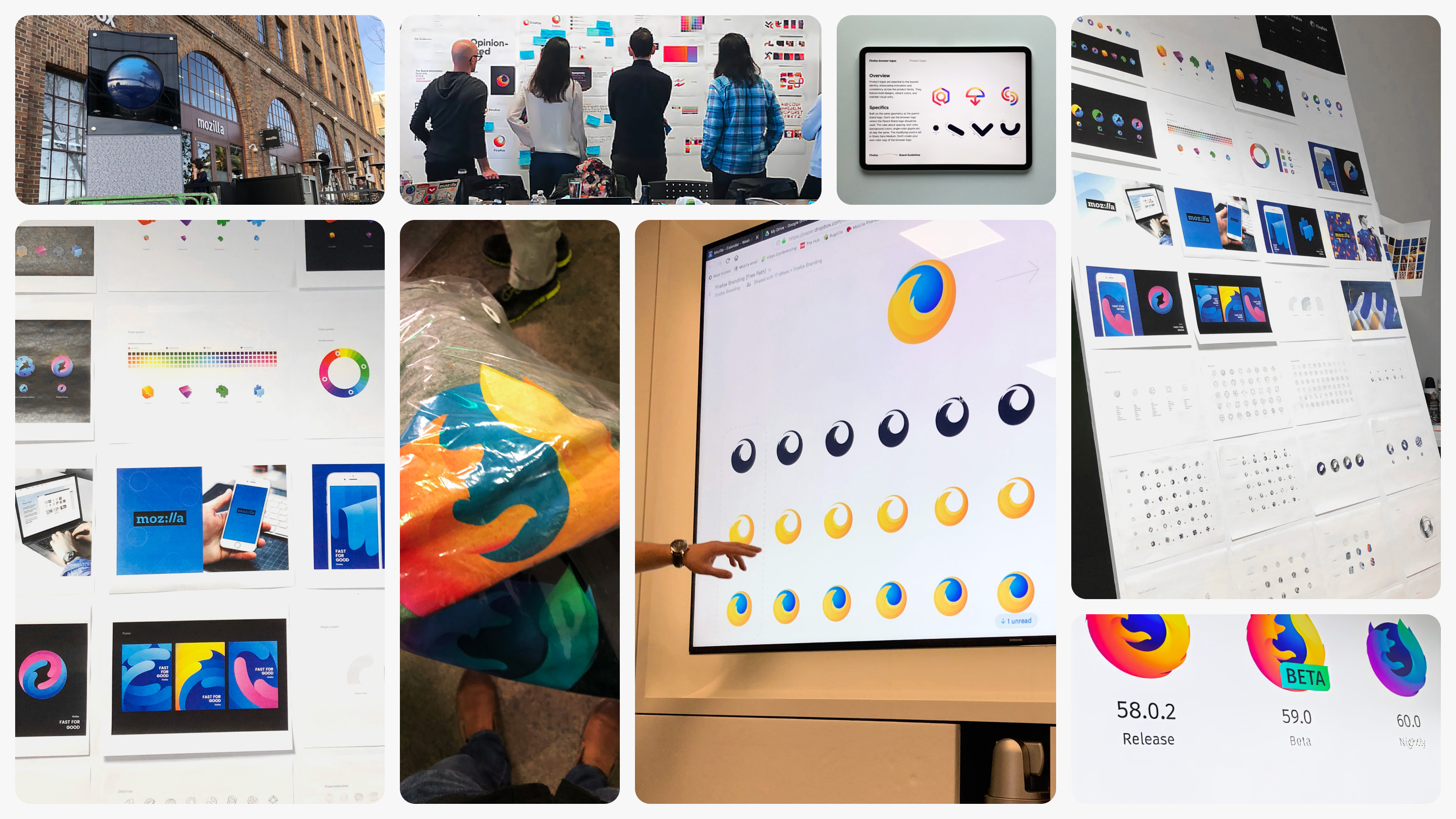
We think structured face-to-face meetings and workshops are a valuable way to build trust among team members. We held our first workshop with Mozilla at their SF office during the initial stages of the project. Our client partner was present in person, and our creative director participated online.
The second workshop took place in the middle of the project after a series of visual studies at Mozilla’s Berlin office. The goal of the workshop was to determine the final direction for how we would present the redesign to their community. Both regroups passed on the client-side iteratively. We posed a topic, discussed it in detail, made a decision, and then moved on to the next question. In the evening, we had dinner and talked informally. We realized that our teams are quite similar, and we both share common values.
Firefox asked the community for feedback
When we reached the visualization stage, the teams discovered that the “Fox” and “Fire” areas had become stylistically similar. Because of this, Firefox decided to combine the work that Sean and John did separately into one consolidated option.
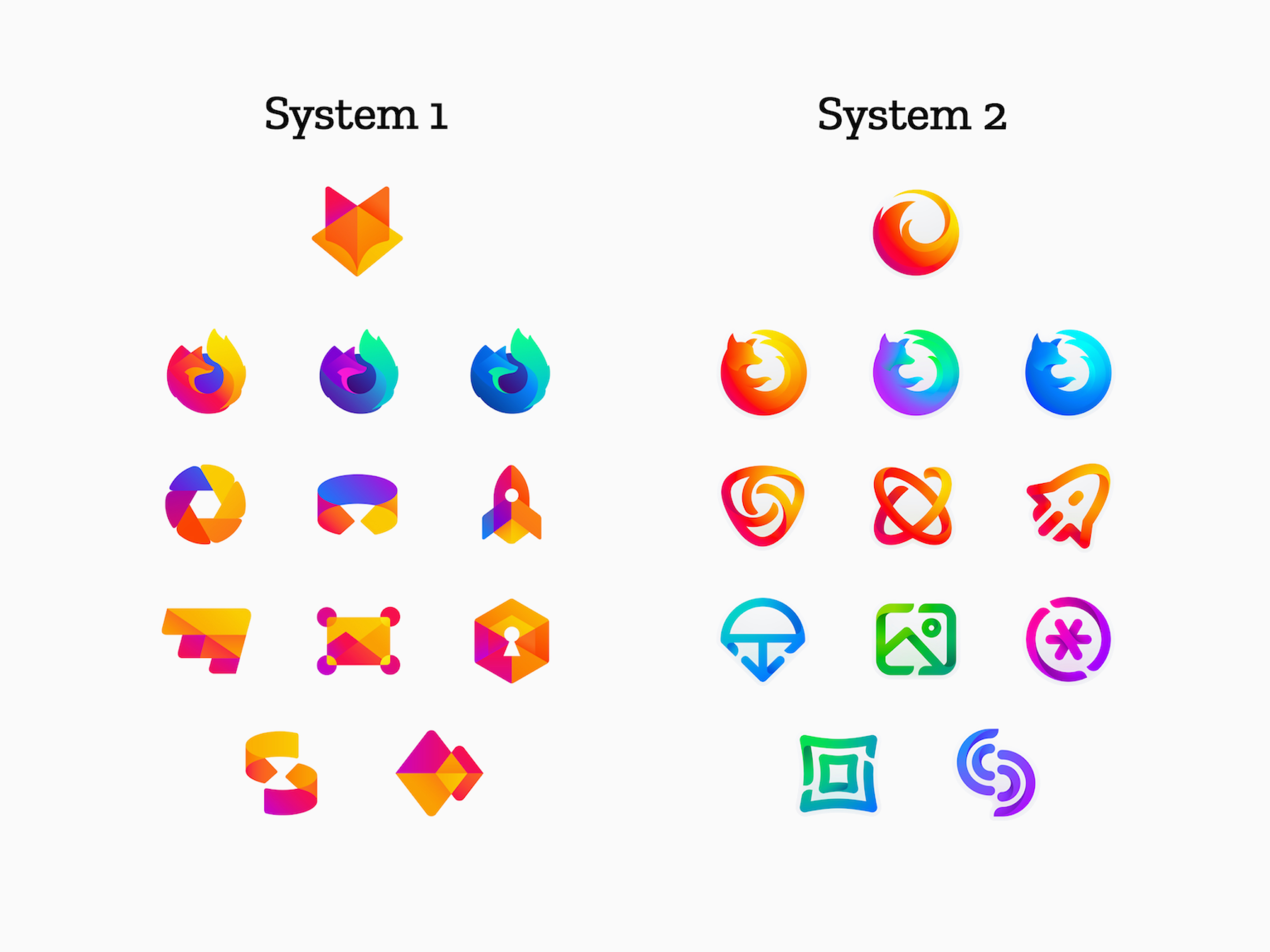
Ramotion continued to work on the “Free” direction as a separate entity. Both teams prepared an intermediate version of the identity. The goal of this step was to show our options to the community, get feedback, and identify the next steps based on the results.
The community reacted passionately and Firefox listened
It was an exciting moment in the project. The community left more than two thousand positive and negative reviews. Mozilla paused to analyze and comprehend this information.
Firefox made the “Solomon decision.”
An analysis of the user comments showed that the audience was not ready for significant changes. Thus, the Firefox team made the “Solomon decision.” For the master brand and sub-products system, they decided to move forward with the “Free” system direction concept created by Ramotion’s team. The Firefox browser icon itself was evolutionarily improved but not dramatically changed.
Atomic components accelerate the generation of visual concepts and carry the brand’s DNA
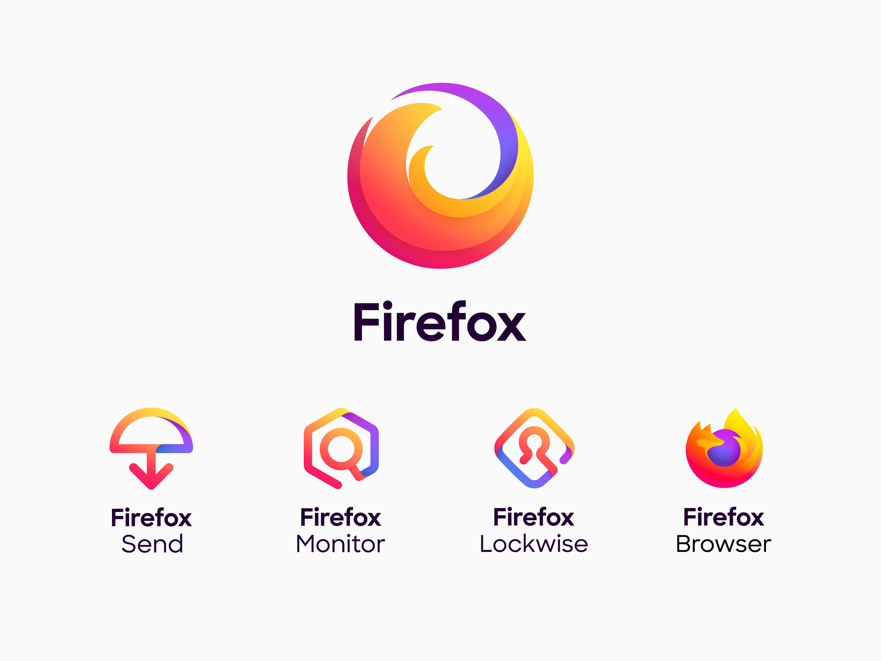
Signs of sub-products consist of simple geometric shapes - atomic particles of the brand. This is the foundation of Firefox’s visual language. Firefox uses sub-products as browser extensions. This dictated the limitation of the size, shape, and nature of these artifacts.
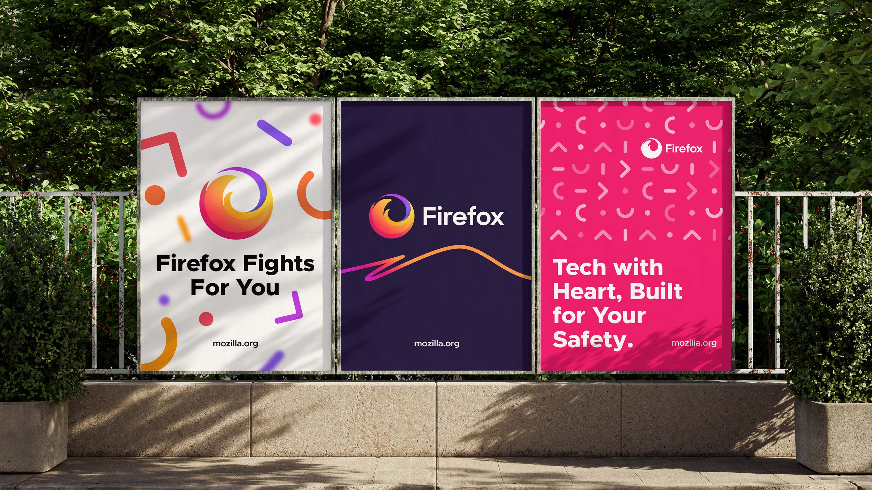
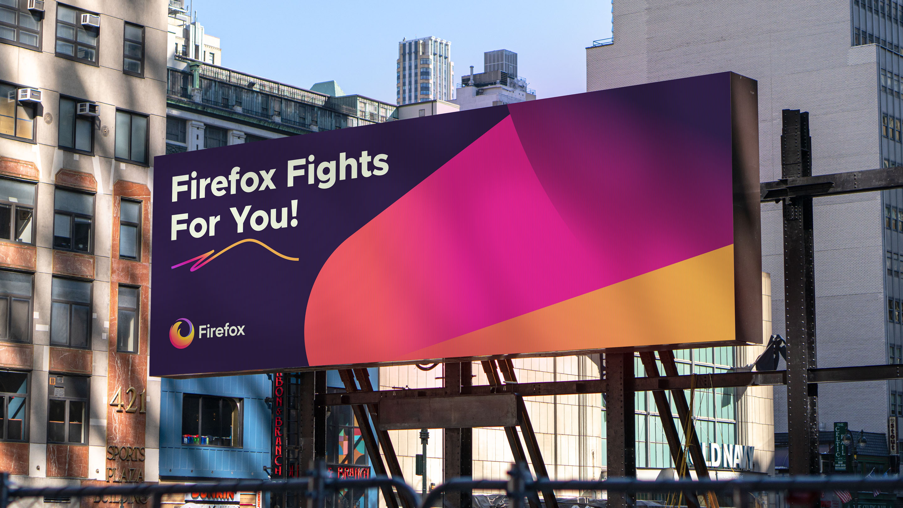
Ramotion developed step by step instructions so that the Firefox team would be able to create and use the identity of the sub-products autonomously by observing the principles laid down. The first example of the use of atomic particles was the design of the campaign “Firefox fights for you.” Ramotion team examined dozens of visual assets, both purely graphic and a combination of brand graphics and photographs.
Visual foundations helped Firefox to evolve guidelines and launch three new products
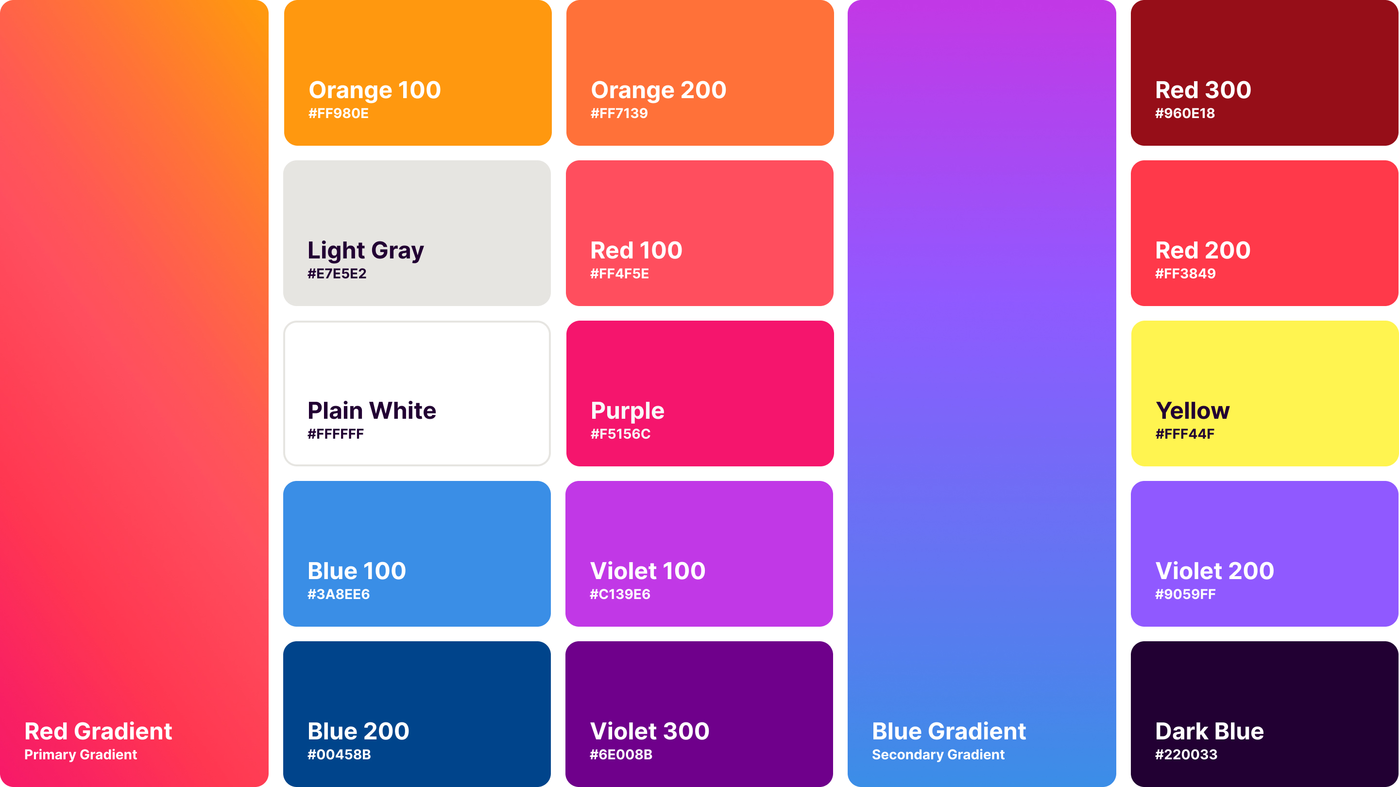
The result was a visual design system that the Firefox team uses independently. The Masterbrand logo retained the dynamics of the original Firefox browser logo and expanded the capabilities of the system. The Firefox team used the guidelines to develop and refine the style while maintaining the principles of the system.
