Fintech onboarding
Discover how the best user experience design agency revolutionizes fintech onboarding with a design concept simplifying financial management.
Functionality
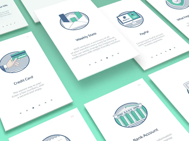
This fintech onboarding user experience design concept is engineered to offer seamless navigation through various financial services. It includes straightforward access to weekly stats, credit card management, PayPal integration, and bank account information, ensuring users can manage their finances with minimal effort.

Design Elements
- Credit Card Management: The design elegantly presents credit card features, emphasizing ease of use with large icons and quick entry fields. This ensures users can add or manage their cards with just a few taps, catering to a hassle-free experience.
- Weekly Stats Overview: A snapshot of weekly financial activity is displayed in a clean, graphically engaging format. This allows users to track spending habits over time and make informed decisions, all through an easily digestible visual presentation.
- PayPal Integration: The concept includes a smooth connectivity option, signifying the importance of diverse payment platforms within the app. It prioritizes a simplified linking process, reflecting the needs of users who prefer digital wallets.
- Bank Account Access: A classic, trustworthy design portrays the fundamental element of bank account management. It’s crafted to provide quick insight into account status and recent transactions, reinforcing user confidence and control over their financial data.
- Interactive Notifications: The design proposes interactive notifications for real-time updates, which is crucial for a dynamic fintech experience. These notifications keep users informed and engaged with their financial landscape.
- User Interface (UI) Simplicity: Using a clean, minimalistic approach, the UI elements are strategically placed for optimal navigability. This reflects the agency's commitment to reducing cognitive load while enhancing the user's journey through the app.
- Visual Consistency: There is a firm adherence to a coherent visual theme throughout the concept. This consistency in design elements, like the color scheme and iconography, fosters a sense of familiarity and ease, which is essential for user retention.
Likely Benefits
Adopting this design concept can significantly enhance user engagement and satisfaction by minimizing complexity and making financial management more accessible. It embodies efficiency and modernity, promising an elevated onboarding experience that retains users by making their first interactions as informative and effortless as possible.
Application of the Design Concept
When applied, users will navigate through a fintech platform that feels intuitive and responsive to their needs. The initial onboarding process is designed to educate and inform, allowing a smooth transition into using the platform's full suite of services.
Subsequently, users can confidently manage their finances, supported by a design that is aesthetically pleasing and functionally robust.
The design's intuitive layout and real-time notifications would keep users proactive about their financial health in day-to-day use. The ease of integrating multiple payment methods would ensure that the platform is not just a tool but a financial companion.
Overall, this fintech onboarding user experience design concept by the best user experience design agency embodies clarity, convenience, and user empowerment. It is a testament to thoughtful design practices that place user needs at the forefront, ensuring that every interaction with the financial platform is straightforward and effective.