eCommerce VR Store
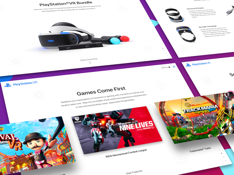
Experienced web designers craft this eCommerce website design concept for PlayStation VR to provide a seamless and interactive shopping experience, highlighting product features through a visually compelling and user-friendly interface.
Functionality
The design concept shows a product page that allows users to learn about the PlayStation VR Bundle, including the primary VR headset, motion controllers, and compatible games.
The functionality includes a product overview, detailed descriptions, images of the products, and sections highlighting the technology and features. Interactive elements such as buttons and sliders suggest users can navigate different sections and purchase directly from this page.

Design Essence and Elements
- High-Quality Product Imagery: The design prominently features high-resolution images of the PlayStation VR headset and accessories, which are crucial for grabbing attention and encouraging further exploration.
- Brand-Specific Color Scheme: Using a color palette that aligns with the PlayStation brand, including blues, whites, and subtle purples, creates a cohesive visual experience and reinforces brand recognition.
- Interactive Elements: Carousel sliders for game previews and a navigational button system enable users to interact with the content, making the browsing experience engaging and user-driven.
- Typography and Legibility: Clean, modern fonts are used for easy readability, with a hierarchy that emphasizes headings and important details, ensuring that users can quickly scan and comprehend the information presented.
- Dynamic Layout with Angled Dividers: Using angled lines and dividers adds a vibrant, modern feel to the layout, breaking the monotony of traditional horizontal sections and guiding the user's eye through the content.
- Organized Product Information: Detailed descriptions are neatly organized, allowing users to find technical specifications and product features without feeling overwhelmed by the text.
- Responsive Design Indicators: The layout suggests adaptability to various screen sizes, indicating that responsive design principles are considered to ensure a consistent experience across devices.
- Visual Hierarchy and Flow: The arrangement of visual and textual elements is crafted to create a logical flow that narratively introduces the product, explains its features, and leads to a call to action, such as purchasing.
- Call to Action (CTA) Buttons: Strategically placed CTA buttons are designed to stand out, prompting users to take the next step, whether to learn more or proceed to checkout.
- Customer Trust Elements: Including customer reviews, ratings, and trust badges could build credibility and trust with visitors. Social Pro
Likely Benefits
The design concept provides an engaging user experience that showcases the product attractively, making it appealing to potential buyers. The interactive elements and detailed information may lead to a higher conversion rate, as users can easily access all necessary details to make an informed purchase.
The visual appeal and brand consistency also enhance brand recall and loyalty.
Application by the User
Users would interact with this design concept by scrolling through the page, viewing different angles and details of the VR bundle, and clicking through the carousel to see various games.
They might also use the navigation buttons to jump to specific sections of interest, such as product features or reviews, and ultimately purchase using an integrated checkout process.
In common, the design concept is applied through a user-centric approach that makes browsing and purchasing straightforward and enjoyable. The layout is structured to guide users through the product's story, from introduction to detailed features leading up to the call to action. Visuals and interactivity engage users, keeping them interested and motivated to explore further.